
5 Easy Peasy Color Theory Thinkings
Let’s start at the very beginning, what IS Color Theory?
“Color theory is the study of how colors work together and how they affect our emotions and perceptions.”
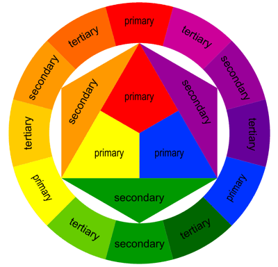
The color wheel breaks down like this:
Primary Colors:
Red, yellow, and blue.
Secondary Colors:
When two primary colors mix, this creates secondary colors- green, orange and purple.
Tertiary Colors:
Tertiary colors are created by combining secondary and primary colors(or primary colors in a ratio of 2:1).
1. Color Schemes
Combinations of colors using the color wheel is known as a “color scheme”. A scheme provides the pleasing aesthetics when it comes style and color appeal. Here’s a list of examples of color schemes:
- Monochromatic:
A variety of tones out of the same hue create a single or monochromatic scheme. - Complementary:
These are colors on opposite sides of the wheel. Upon mixing two of these colors, the result will be a muddy brown color. - Split Complementary:
These are two colors on opposite ends of the color wheel, with one of them split into two more adjacent colors. For example yellow-green. - Analogous color scheme:
You can create it using colors that find a place next to each other on the color wheel; for example, an ombre color scheme. (one of my personal favorites!) - Triadic:
Space out triadic hues equally on the color wheel. - Tetradic:
Variants of dual colors are distributed evenly across the color wheel.
2. Color Psychology
Psychological Effects of Colors
Did you know that colors evoke emotions, influence moods, and set the tone?
Warm colors like red, yellow, orange are often associated with love, passion, anger, and happiness. Cool colors like blues and whites are associated with peace and tranquility and have a calming effect.
Green
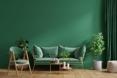
Shown above: Light Filtering Color: Avocado
Green is commonly thought of as sign of health, plants, growth and earth. It also symbolizes wealth. People respond positively to green and often rate it as their second favorite color. Like blue, green has been shown to increase creativity, so it’s an excellent color choice for office walls.
White
White brings to mind, purity, innocence, and completion. White psychologically in interior design can bring feelings of clean, crisp or cold. White of course, helps a space look large. The right shade of white can make a room look modern and stylish and the wrong can make a room seem sterile and frigid.
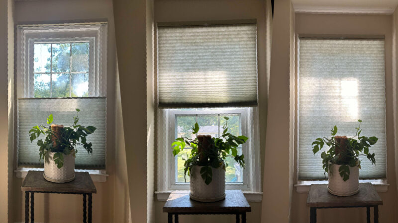
Grey
Grey is a color that is between black and white, grey is the universal symbol of neutrality, objectivity and detachedness. It often represents impartial judgement and is frequently associated with the judicial system, fairness and truth. Greys are considered some of the most trendy neutral colors. They work well with various interior styles: modern, victorian, plush, simple, etc.


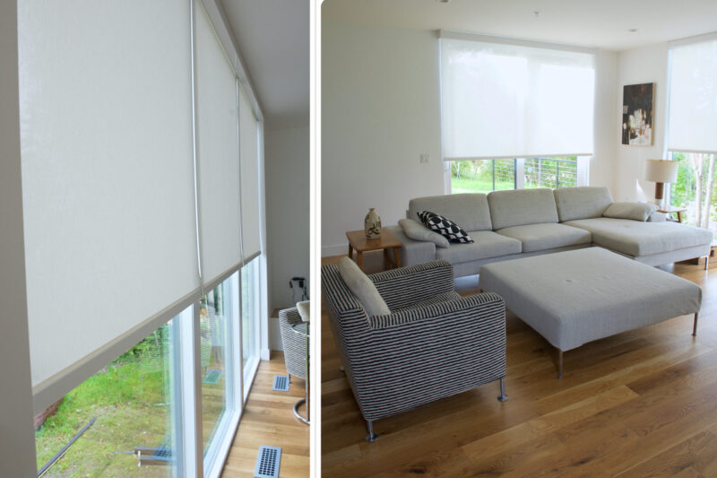
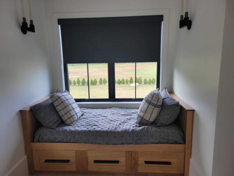
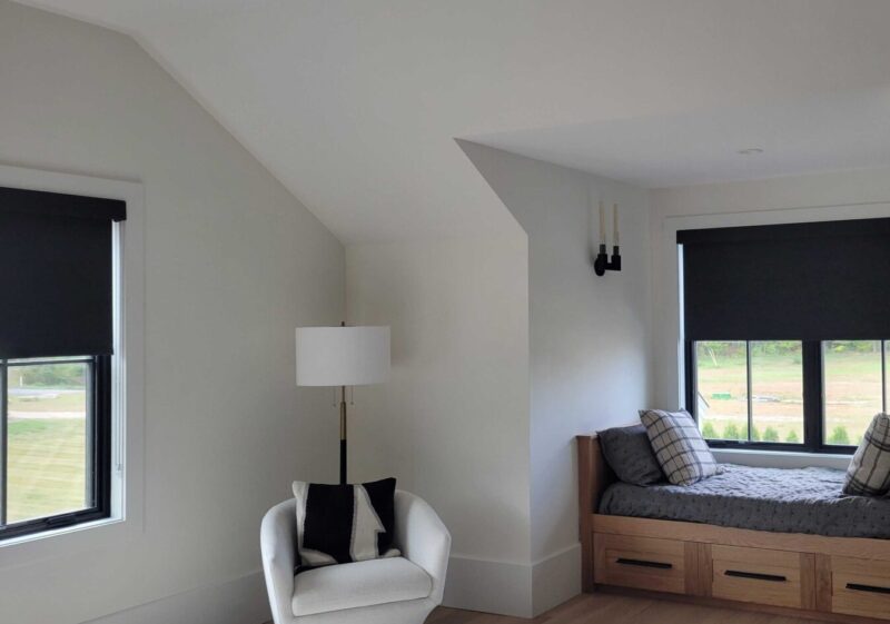
On the left: EcoSmart Roller Shade with Room-Darkening Fabric Color: Armour
On the right: EcoSmart Cell Shade with Light-Filtering Fabric Color: Classic Grey
Black
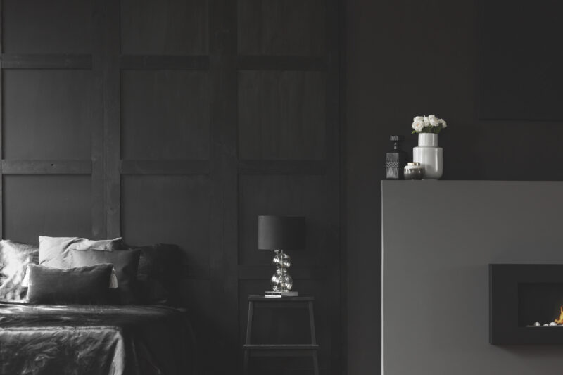
Black is the strongest of the neutral colors. It’s commonly associated with elegance, power, and formality. Buuuuut on the other hand, it is often associated with evil, death, and mystery. Black is the traditional color of mourning in many Western countries.
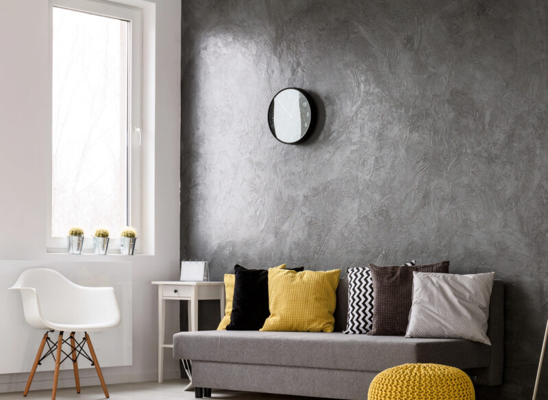
YELLOW
Using yellow in interior design can be tricky. Why? Yellow often evoke feelings of dingy/dirty and dullness. Yellow rooms can kindle negative feelings of frustration. In color psychology, yellow is considered both energetic, as well as negative.
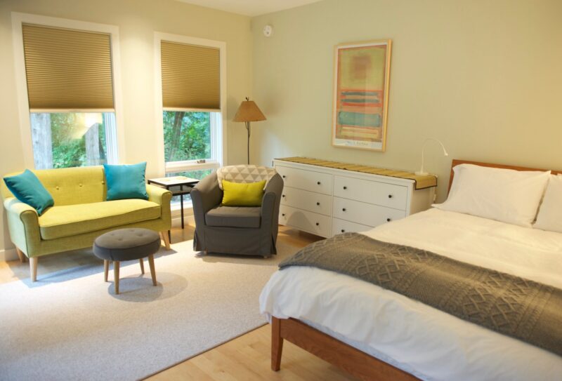
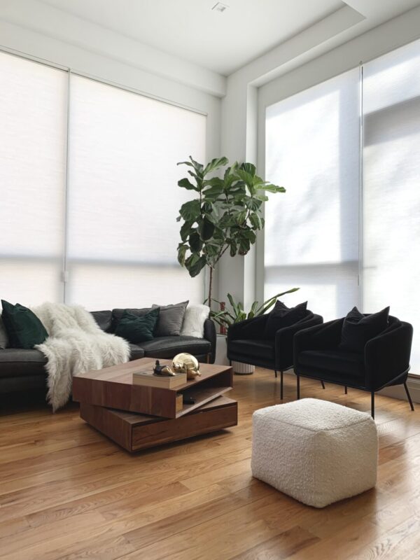
Left: Light Filtering Cellular Shade Color: Taupe
Right: Room Darkening Cellular Shade Color: Taupe

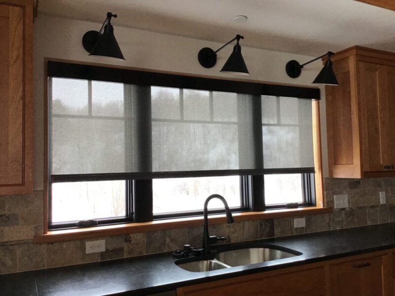
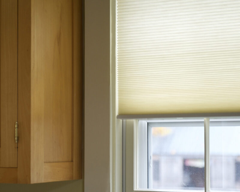
Light Filtering Roller Shade Color: Beige/Beige
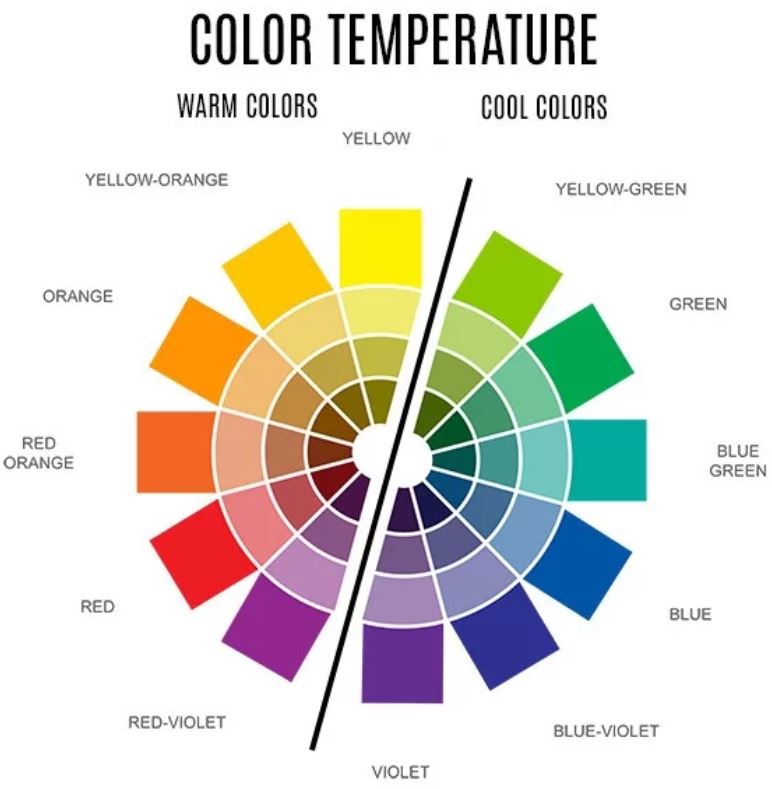
3. Color Temperatures
In a color wheel, warm hues are present around a particular color. In determining a color temperature, one is mindful of the placement of the color on the wheel and how close it is to blue and yellow.
- Warm: Yellow, Reds, Beige
- Cool: Blue, Green
4. Color Mixing
As an interior designer or a homeowner looking to spruce up their home, it is vital to know what colors go well together and how to derive more shades from the base of each color.
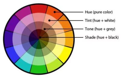
- Hues: refer to colors on the color wheel.
- Tones: proportion of black and white added to a color saturates it and creates a tone.
- Tints: Add white to a color on the wheel, it lightens the color, giving it a pastel or less intense shade.
- Shades: (no no, a DIFFERENT type of shade) Add black to a hue on the color wheel gives the color a shade. Shades depend on the proportion of black added to a given color.
5. Color Context
Color context. Color has many meanings in numerous settings. Like we mentioned already, color will evoke feelings and emotions and have a variety implications in different contexts.
Keeping things ‘in context’ is so important in everyday conversation annnnd color theory! Color context includes physical space and the psychological mindset to create an ideal vibe and atmosphere.
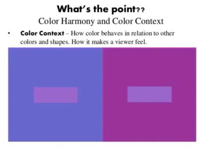
Check this out.
Here’s a great example of the color context when it comes to room-darkening and light-filtering fabrics.
The room-darkening white has a tendency to look DARKER than it actually is, because of shadowing. While the sunshine cascading through our light-filtering cellular fabric can look blue-ish or yellow, depending on the sunlight!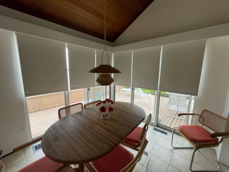
 Inspired with color? Talk to our Shade Gurus now!
That’s smart. Ecosmart.😉
877-338-9392
Many thanks to www.foyr.com for some of these thinkings!